Home page

Modules

Hero Banner
 Banner module in which you can change image , text to suit your brand theme 

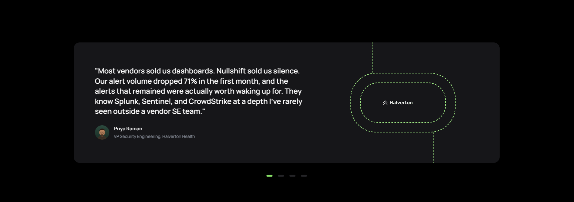
Testimonial
Customer testimonial slider with company logo, quote text, author photo, name, and designation.

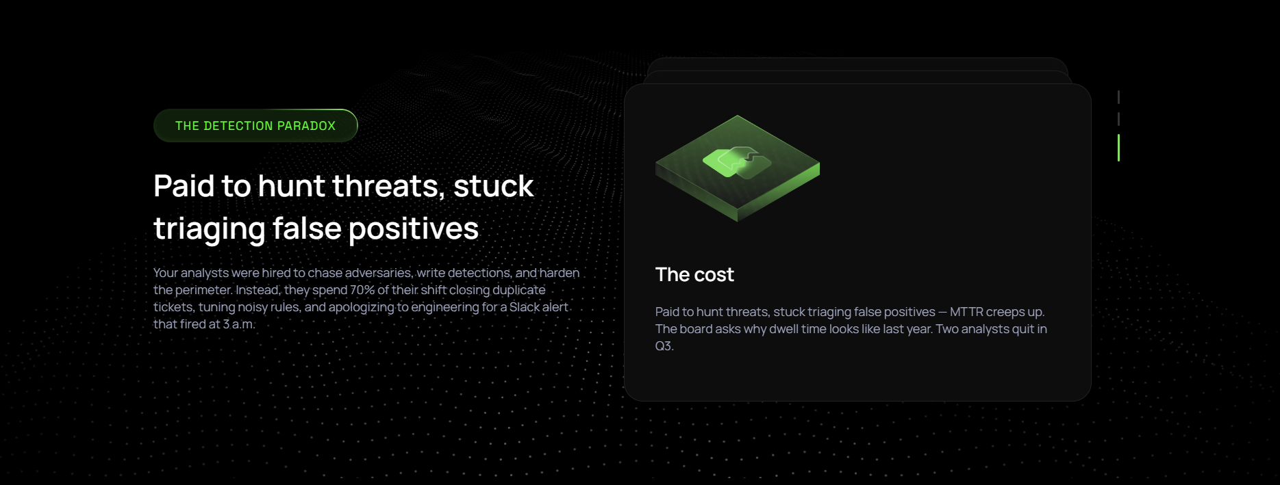
Card Stack Module
Stacked scroll animation section with background image, section title, subtitle, description, and card images.

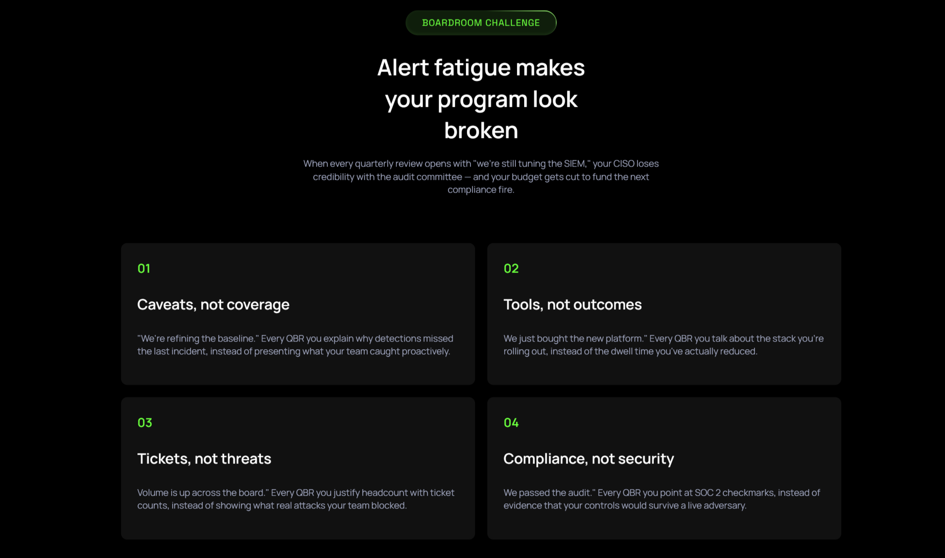
Two Column Text Cards
Two-column numbered or icon text cards with subtitle, section title, description, and per-card number, title, description.
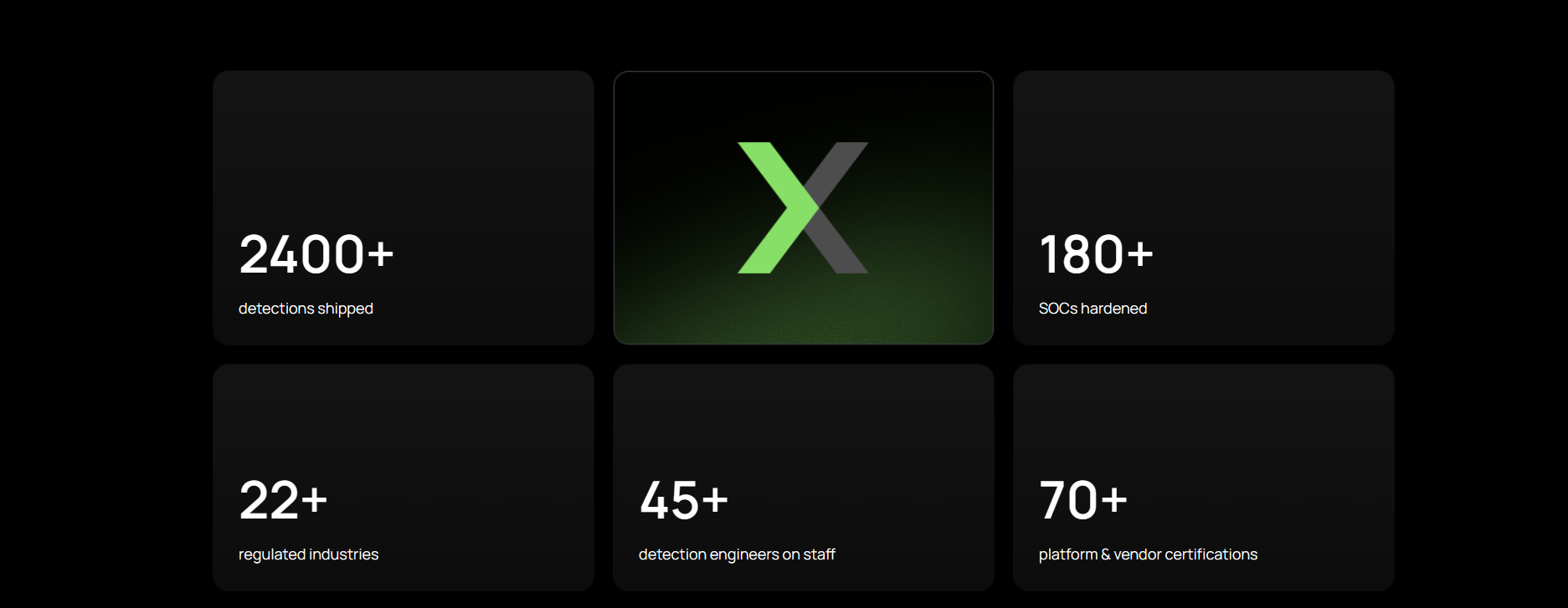
Tab Module With Cards

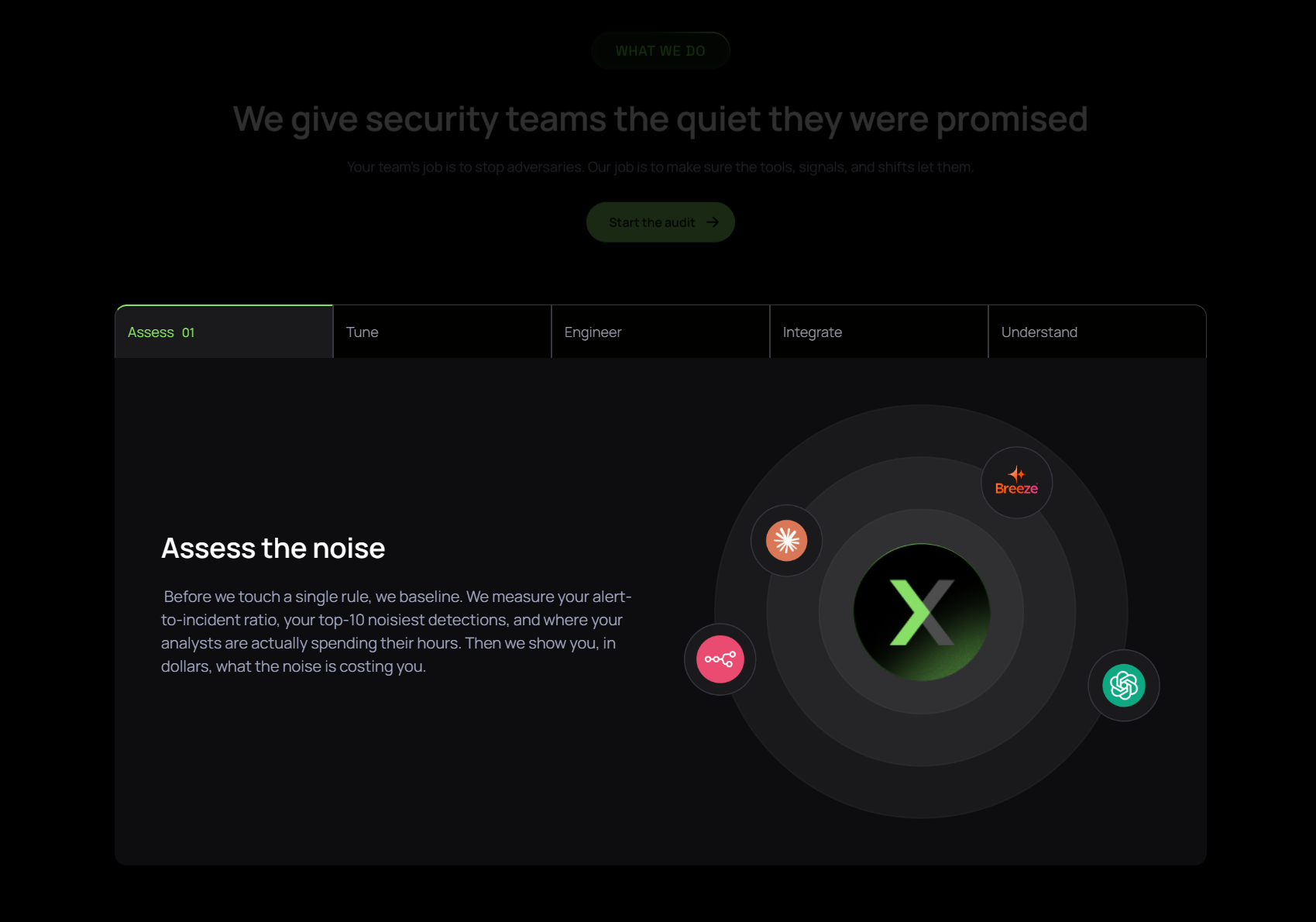
 Interactive tabbed section (4–6 tabs) with a section title, subtitle, description, and CTA. Each tab has a button label, title, rich text, and image; below sits a row of 5 stat cards with a number, sign, and label each. 


Logo Carousal
 Auto-scrolling logo strip on a dark background. Upload logo images; the carousel loops continuously with no additional settings. 

Two Column Resource Cards
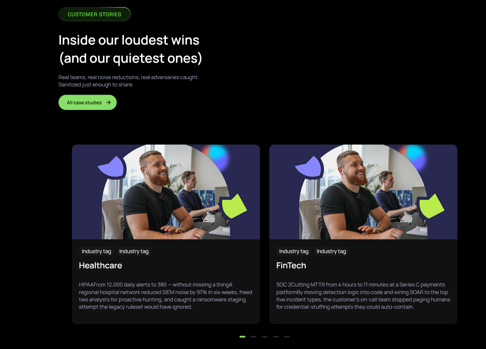
Two-column resource card layout with section title, subtitle, description, background image, and per-card image, title, description.
Three Column Cards
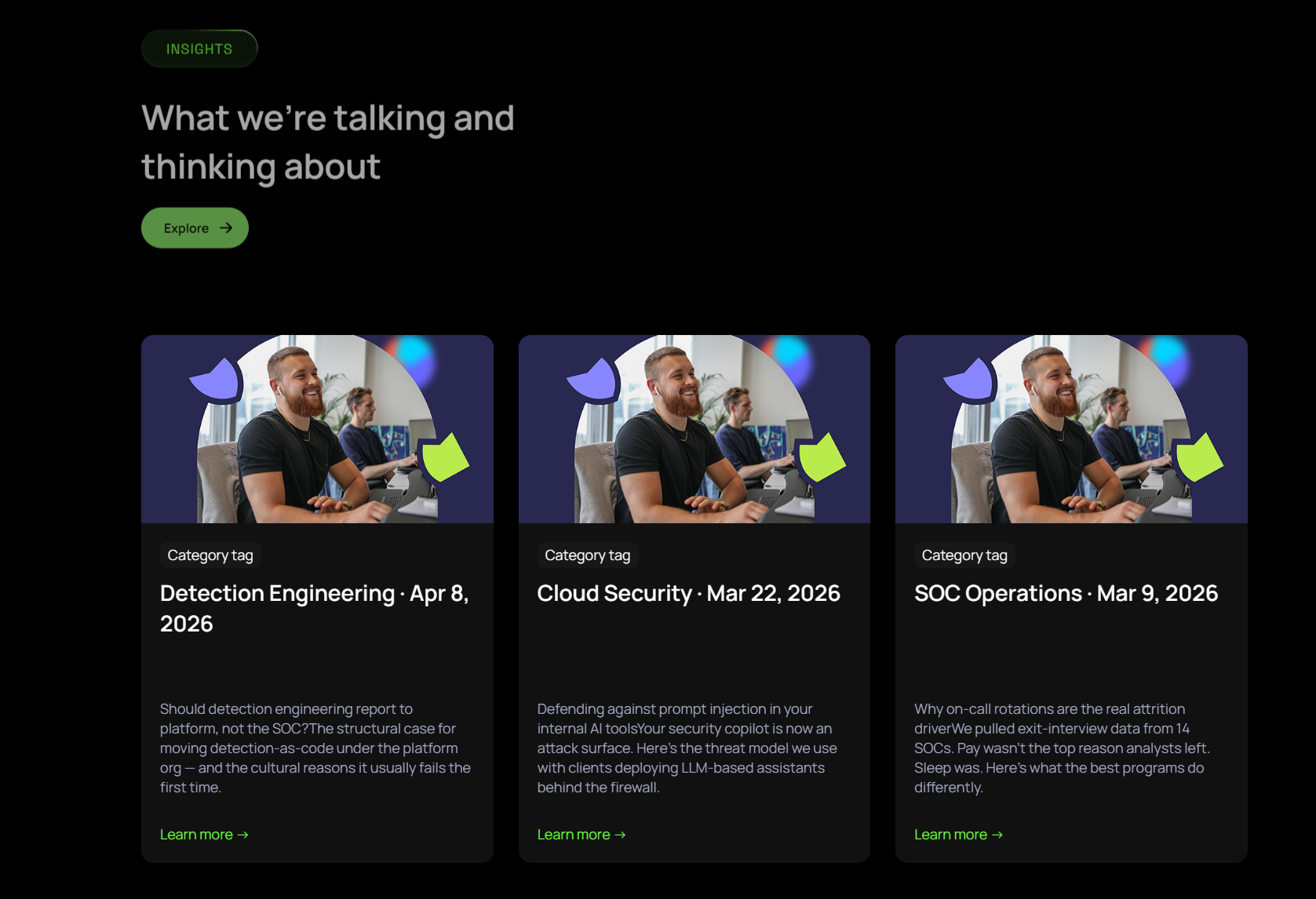
Three-column card grid; pull cards from a HubSpot blog or enter manually with image, tag, title, description, and link.
Cta Section

 Full-width CTA banner with a two-part heading (plain + green highlighted text) and a single button. Edit both heading lines, the highlighted phrase, and the button label and link. 

Platform Master Page

Modules

Banner With Video
 Hero banner with a title, subtitle, background images, and an embedded video. Edit the review image, background, and left/right decorative images.  


Tab With Card Content
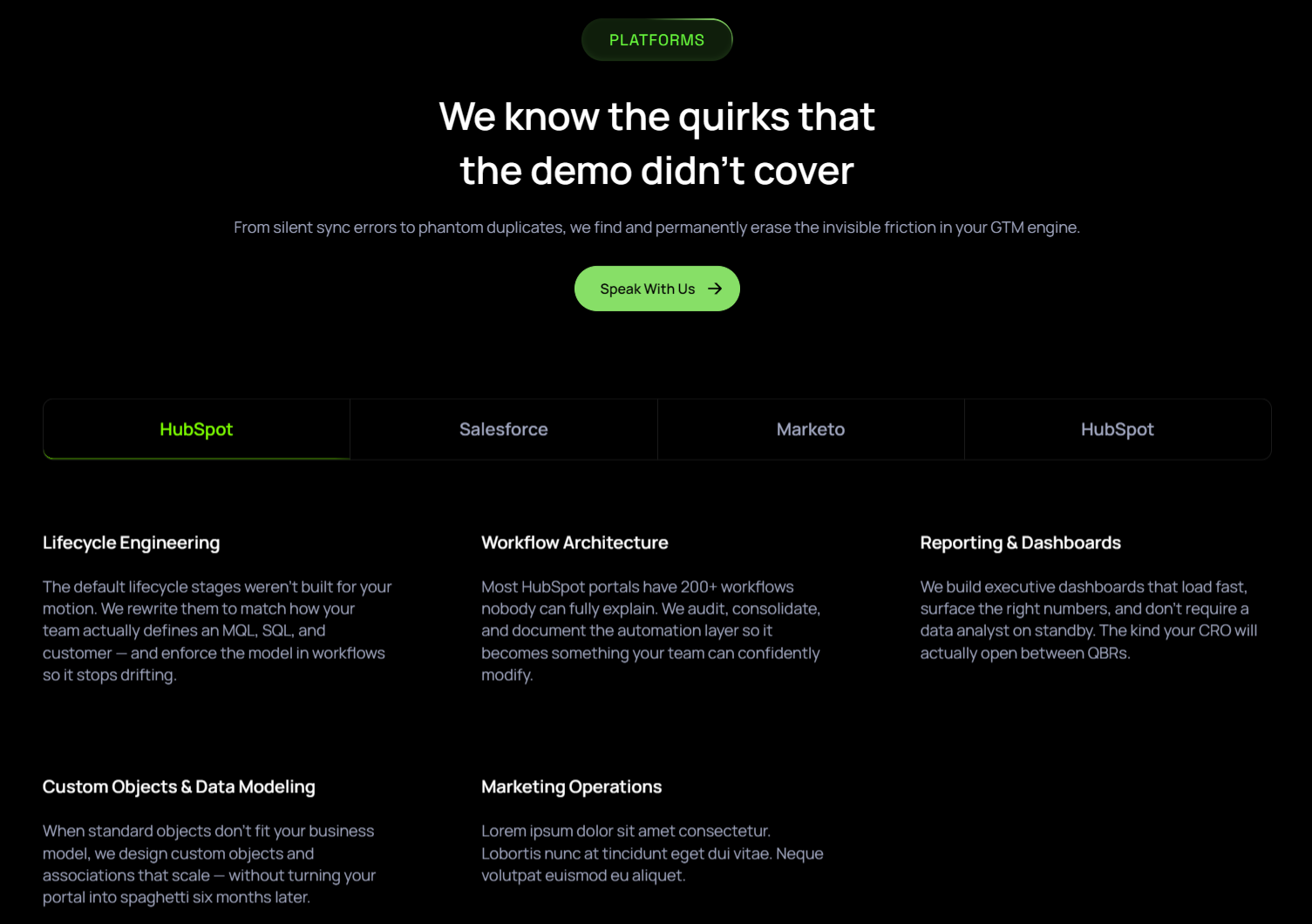
 Tabbed content section with a section title, subtitle, description, and CTA button. Each tab has a title and rich-text content. 

What We Do Cards
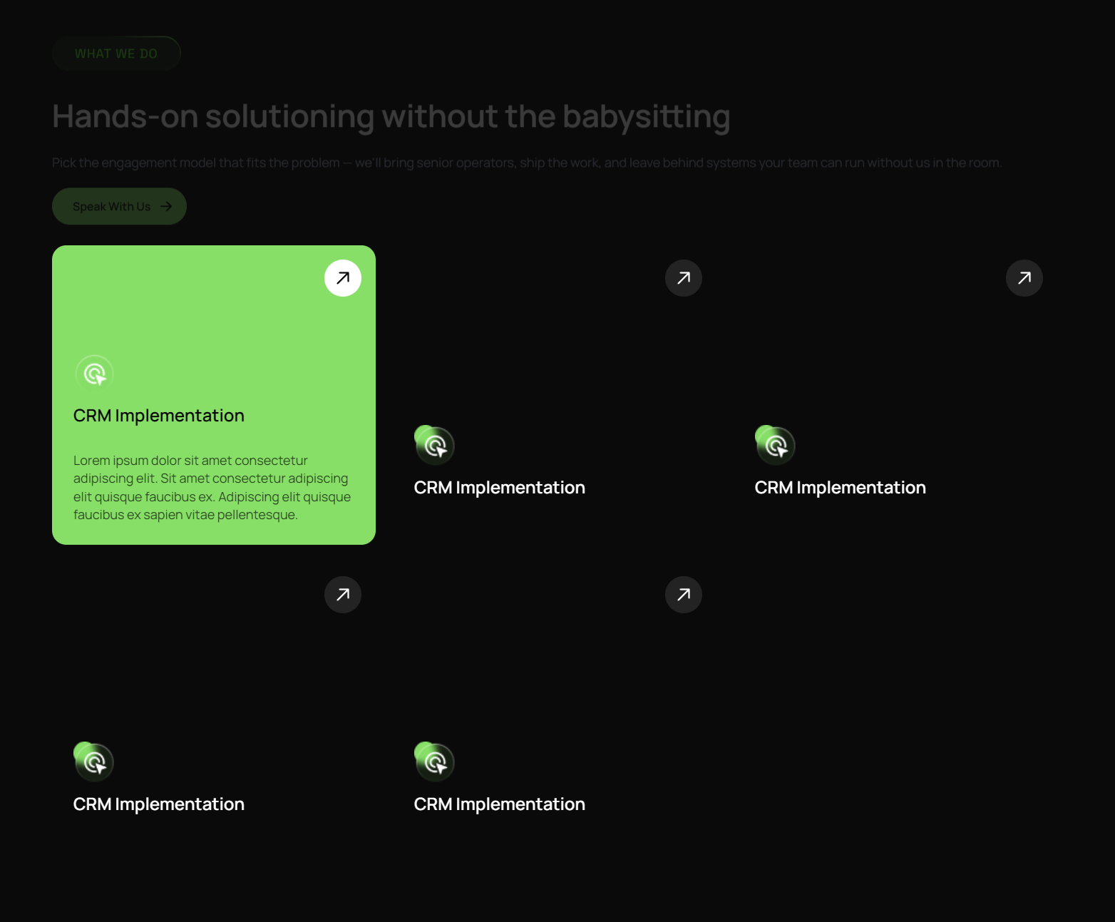
 Service feature cards with a section subtitle, title, description, and CTA button. Each card has an image, title, and description. 

Cta Section

 Full-width CTA banner with a two-part heading (plain + green highlighted text) and a single button. Edit both heading lines, the highlighted phrase, and the button label and link. 

About

Modules

Banner With Video
 Hero banner with a title, subtitle, background images, and an embedded video. Edit the review image, background, and left/right decorative images.  


Card Stack Module
Stacked scroll animation section with background image, section title, subtitle, description, and card images.

Three Column About Cards
 Three-column feature cards section with a section title, subtitle, and description. Each card has an image, title, description, and link; supports left/right background images. 
Two Col Image Text Module

 Side-by-side section with an image and rich-text content block. Choose whether the image appears on the left or right. 
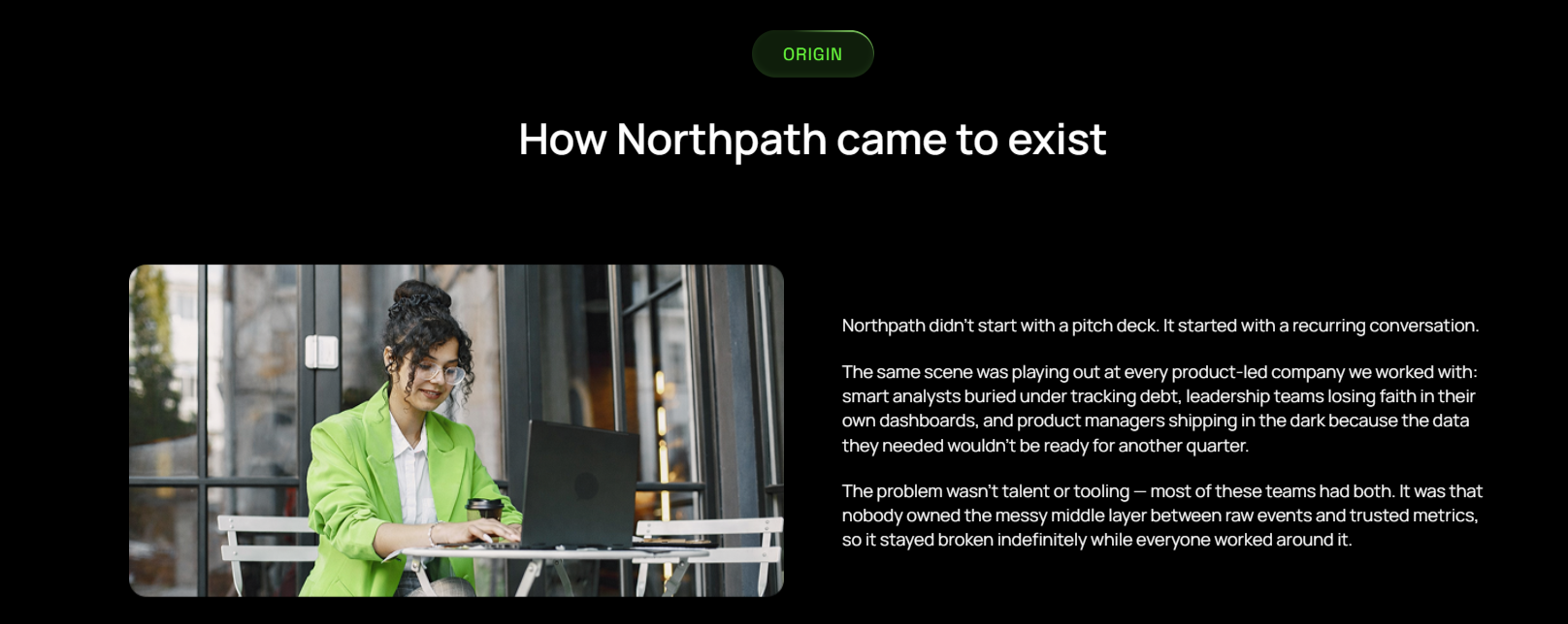
Two Column Text Cards
Two-column numbered or icon text cards with subtitle, section title, description, and per-card number, title, description.
Team Module
Team member grid with subtitle, section title, and repeating member cards (photo, name, designation, LinkedIn).
Cta Section

 Full-width CTA banner with a two-part heading (plain + green highlighted text) and a single button. Edit both heading lines, the highlighted phrase, and the button label and link. 

Academy

Modules
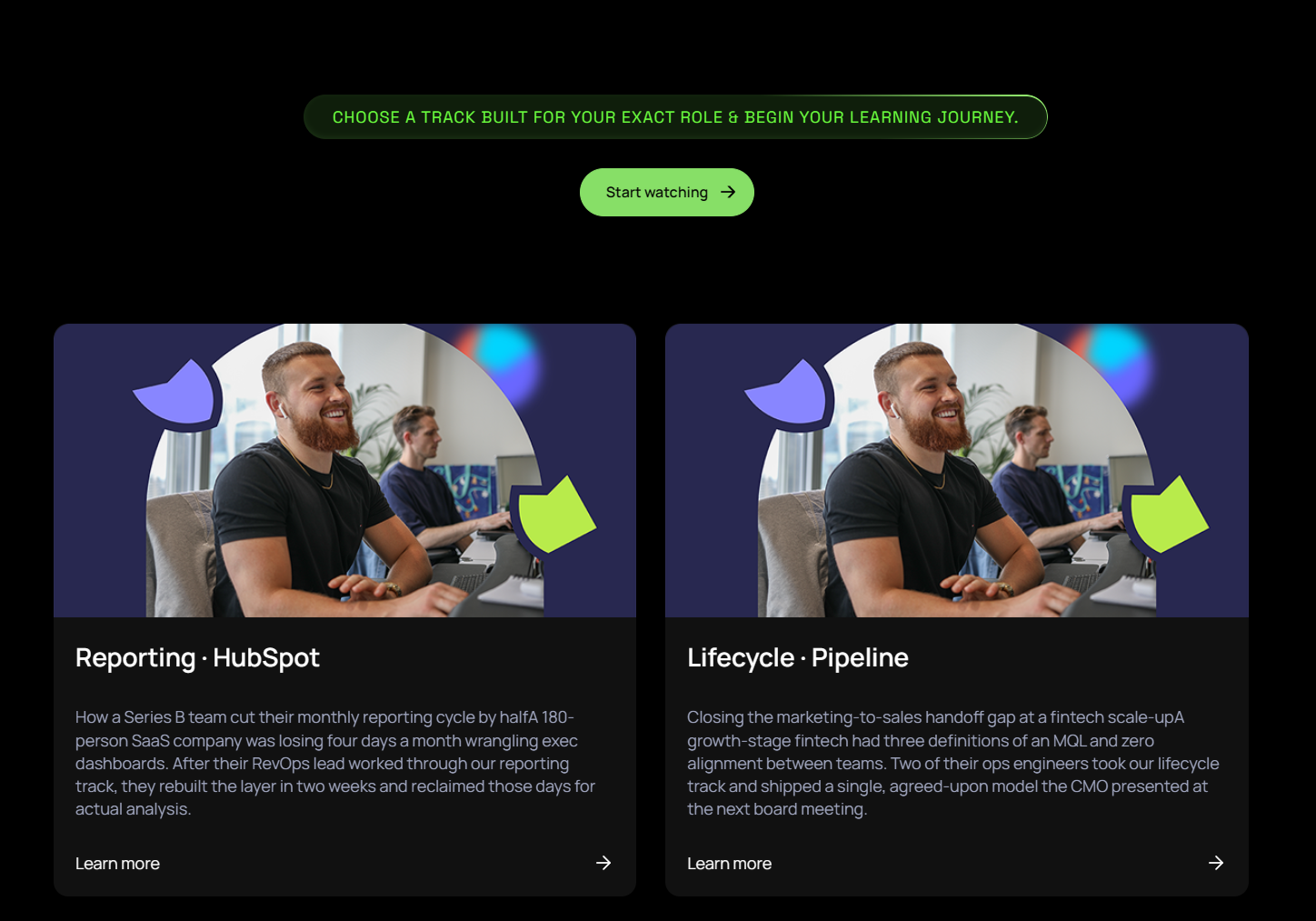
Banner With Video
 Hero banner with a title, subtitle, background images, and an embedded video. Edit the review image, background, and left/right decorative images.  


Two Column Resource Cards V2
Two-column resource layout with a section title, subtitle, description, and CTA link. Each card has an image, title, and description.
Two Col Text Cards
 Two-column info/service cards with a section title, description, and CTA button. Each card has an icon, title, description, and link.
Cta Section

 Full-width CTA banner with a two-part heading (plain + green highlighted text) and a single button. Edit both heading lines, the highlighted phrase, and the button label and link. 

Apply for job Page

Modules

Banner With Content

Inner page hero with a title, subtitle, and background images. Includes job metadata fields (type, experience, employment type) for career pages.

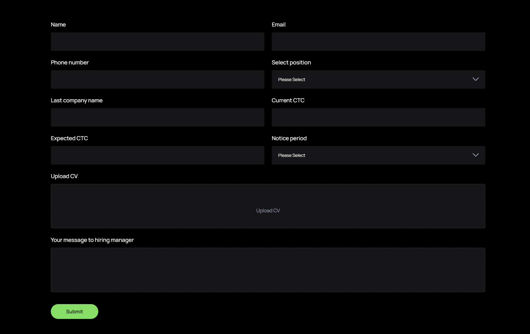


Job Apply Form
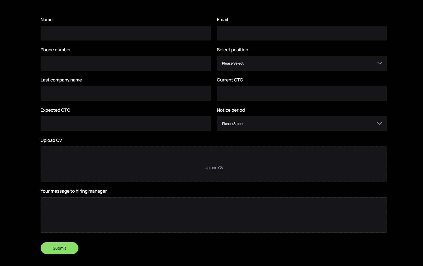
 Embeds a HubSpot application form for a job opening. Select the form from your HubSpot account. 


Book A Meeting

Modules

Banner With Video
 Hero banner with a title, subtitle, background images, and an embedded video. Edit the review image, background, and left/right decorative images.  


Book A Meeting
Embeds a HubSpot meetings widget via a widget code. Optionally replace it with a HubSpot form with a custom title and date/time field.


Career Individual Page

Modules

Banner With Content

Inner page hero with a title, subtitle, and background images. Includes job metadata fields (type, experience, employment type) for career pages.
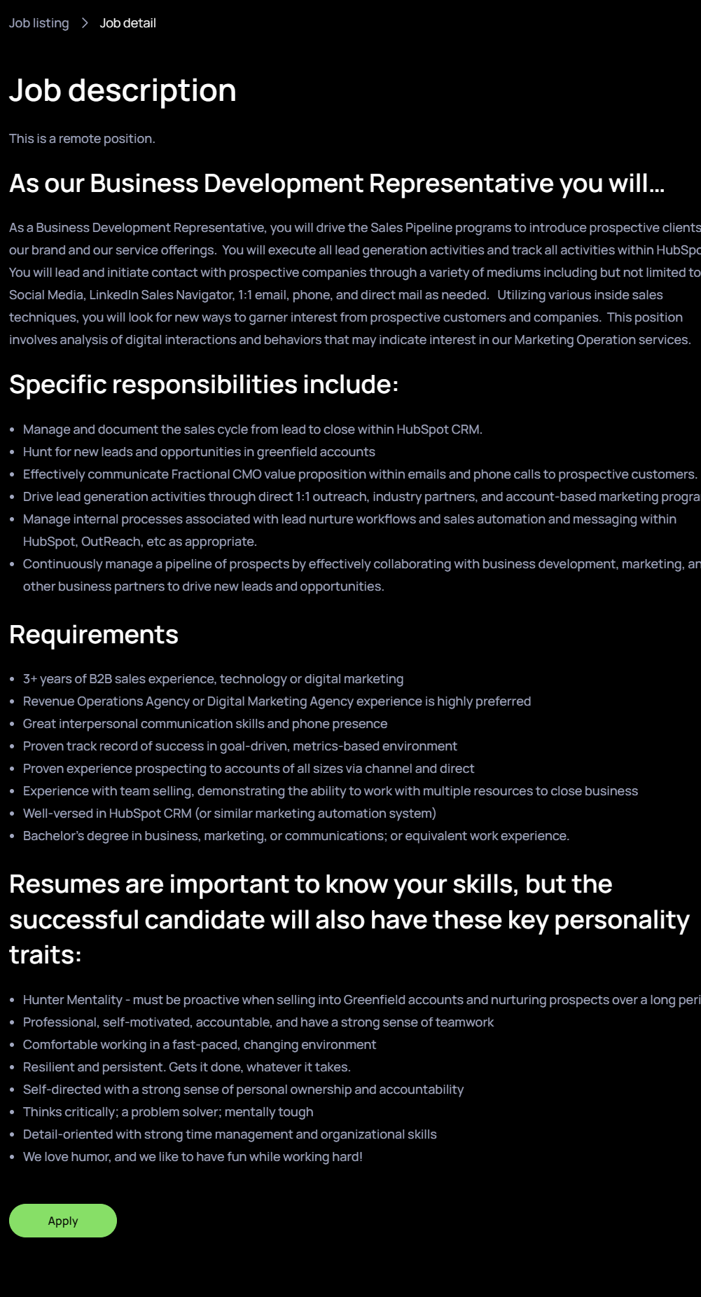
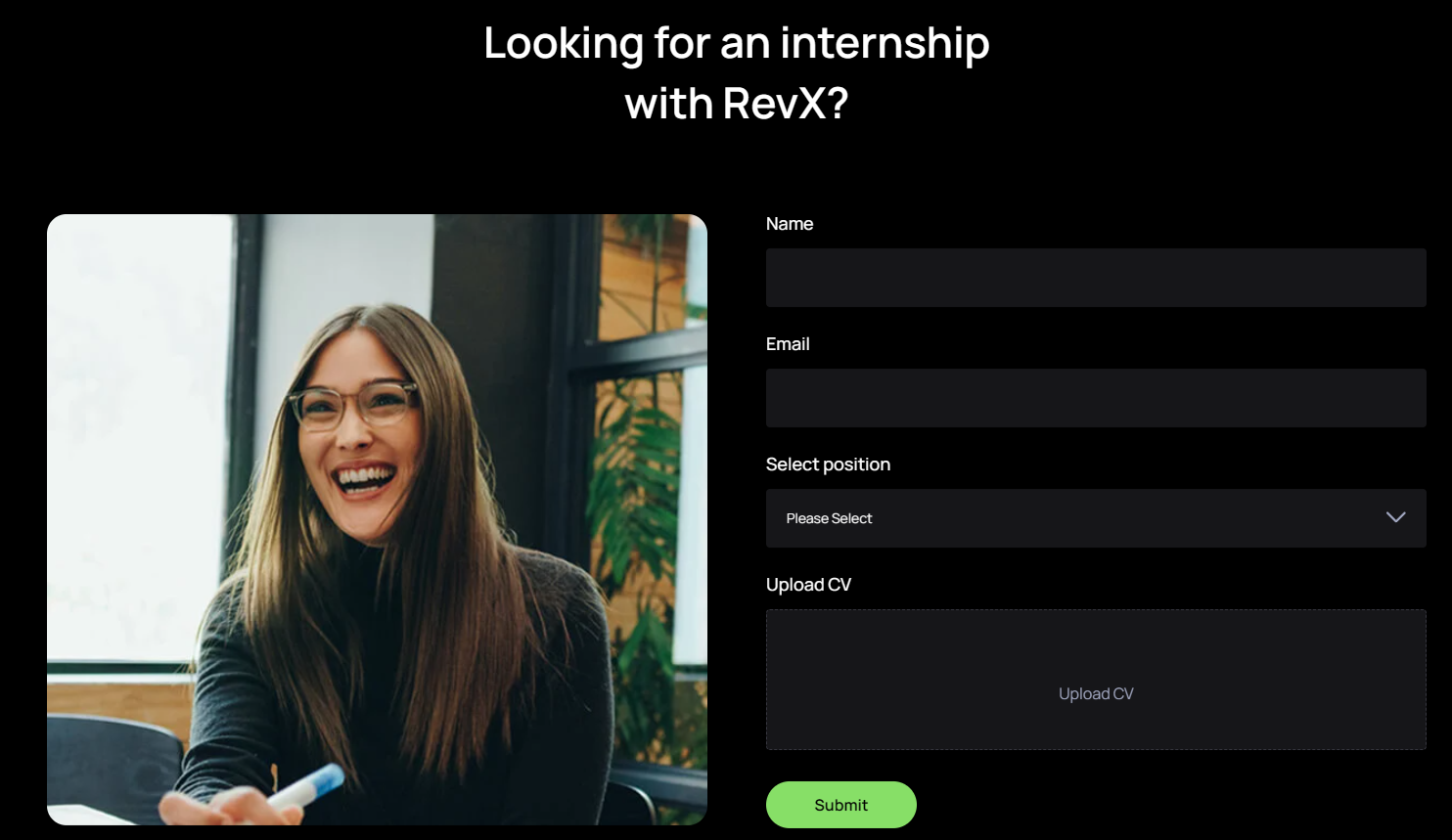


Job Description
 Structured job detail block with a breadcrumb link, rich-text description body, and additional text and link fields. 


Internship Form
Internship application section with a title, image, and an embedded HubSpot form. 

Career Page

Modules

Banner With Video
 Hero banner with a title, subtitle, background images, and an embedded video. Edit the review image, background, and left/right decorative images.  


Four Column Cards
 Four-column icon-and-title card grid for careers pages. Each card has an icon and title. 


Team Cards
 Job listing cards with a title, job type, experience level, and apply link. 
Gallery

Image gallery grid for the careers page. Add a title and upload images for each gallery item.. 
Internship Form
Internship application section with a title, image, and an embedded HubSpot form. 
Team Module
Team member grid with subtitle, section title, and repeating member cards (photo, name, designation, LinkedIn).

Contact

Modules

Banner With Video
 Hero banner with a title, subtitle, background images, and an embedded video. Edit the review image, background, and left/right decorative images.  


Contact Cards And Map
 Contact section with a title, description, and a map image. Each contact card has an icon, title, and description. 


Event individual Page

Modules

Inner hero
 Inner page hero with an eyebrow, title, hero image, and a rich-text content block. 


Description Box

Rich-text content block for inner pages. Accepts any formatted copy.


Three Col Images
 Three-column image grid with a title and image per column. 
Cta Section

 Full-width CTA banner with a two-part heading (plain + green highlighted text) and a single button. Edit both heading lines, the highlighted phrase, and the button label and link. 

Event Cards

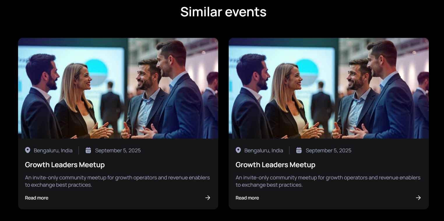
 Grid of event cards each with an image, location, date, title, description, and link. 

Cta Section

 Full-width CTA banner with a two-part heading (plain + green highlighted text) and a single button. Edit both heading lines, the highlighted phrase, and the button label and link. 

Event Page

Modules

Banner With Video
 Hero banner with a title, subtitle, background images, and an embedded video. Edit the review image, background, and left/right decorative images.  


Events
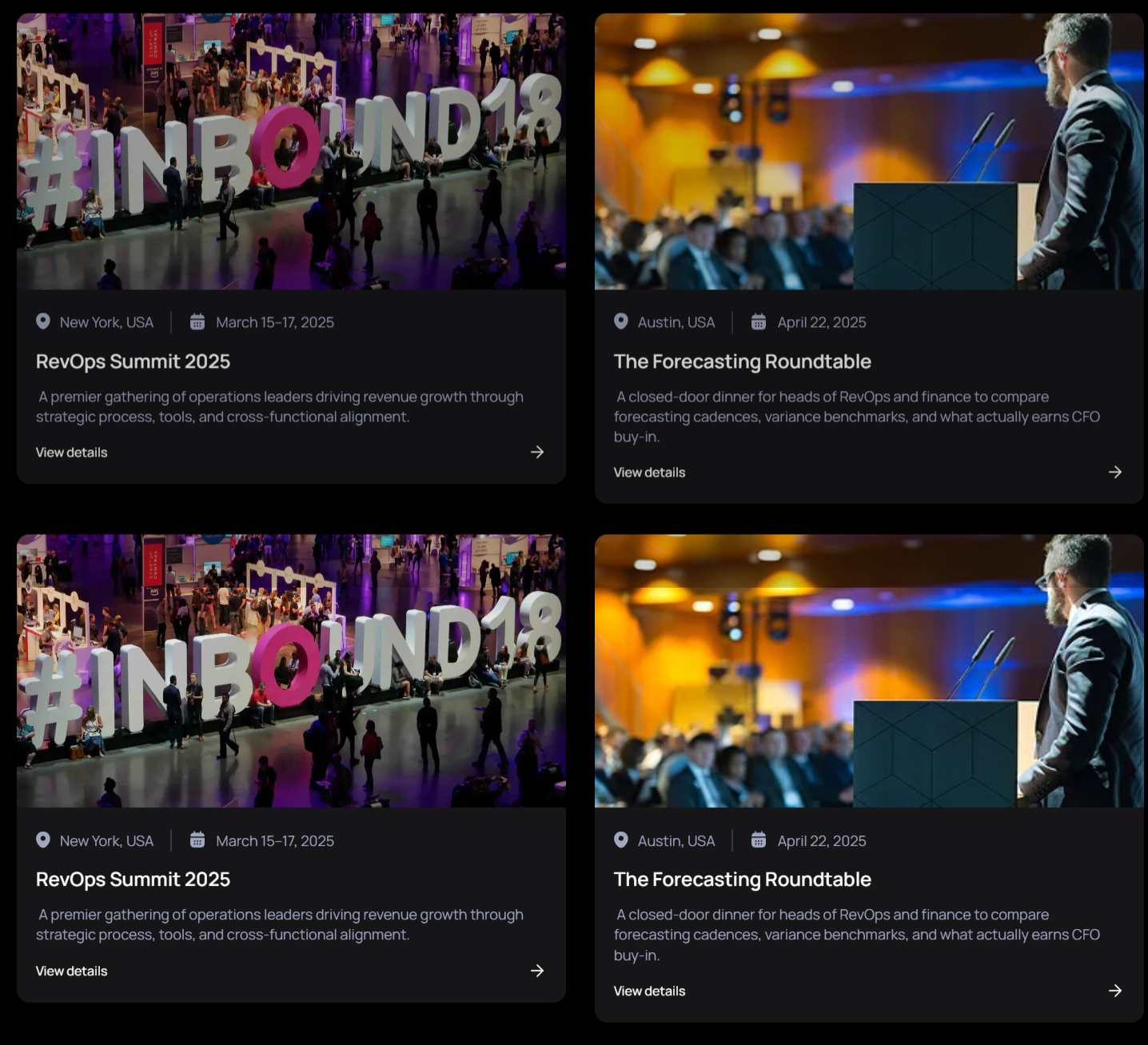
 Full event listing with an upcoming/past toggle. Each event has an image, location, date, title, description, and link 


Cta Section

 Full-width CTA banner with a two-part heading (plain + green highlighted text) and a single button. Edit both heading lines, the highlighted phrase, and the button label and link. 

Marketing Ops

Modules

Services Banner Img Text
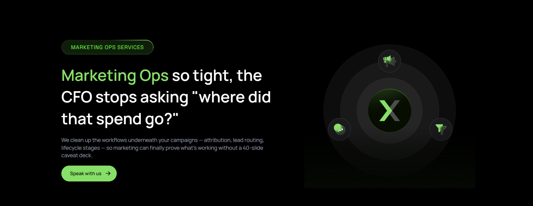
 Services page hero with a subtitle, title, description, and a main section image. 


Testimonial
Customer testimonial slider with company logo, quote text, author photo, name, and designation.

Cards With Pointertext
 Feature section with a subtitle, section title, and repeating highlight cards with titles. 
Two Column Resource Cards

Two-column resource card layout with section title, subtitle, description, background image, and per-card image, title, description.

Faq
 Accordion FAQ section with a title, description, and background images. Each item has a question and rich-text answer. 

Cta Section

 Full-width CTA banner with a two-part heading (plain + green highlighted text) and a single button. Edit both heading lines, the highlighted phrase, and the button label and link. 

Partnership

Modules

Banner With Video
 Hero banner with a title, subtitle, background images, and an embedded video. Edit the review image, background, and left/right decorative images.  


Partners Details
 Partner showcase with a subtitle, title, and description. Each partner card has a badge, image, description, and adjustable width. 


Three Column About Cards
 Three-column feature cards section with a section title, subtitle, and description. Each card has an image, title, description, and link; supports left/right background images. 
Cta Section

 Full-width CTA banner with a two-part heading (plain + green highlighted text) and a single button. Edit both heading lines, the highlighted phrase, and the button label and link. 

Platform Individual Page

Modules

Platform Banner Img Text
 Platform page hero with a subtitle, title, description, platform logo, and a main section image.  


Logo Carousal With Text
 Scrolling logo strip paired with descriptive text. No editable fields — content is set inside the module template. 


Cards With Pointertext Center
Three-column feature cards section with a section title, subtitle, and description. Each card has an image, title, description, and link; supports left/right background images.
Two Column Resource Cards

Two-column resource card layout with section title, subtitle, description, background image, and per-card image, title, description.

Four Column Resource Cards
Two-column numbered or icon text cards with subtitle, section title, description, and per-card number, title, description.
Faq
Accordion FAQ section with a title, description, and background images. Each item has a question and rich-text answer. 
 
Cta Section

 Full-width CTA banner with a two-part heading (plain + green highlighted text) and a single button. Edit both heading lines, the highlighted phrase, and the button label and link. 

Podcast Inner Page

Modules

Podcast Inner Banner
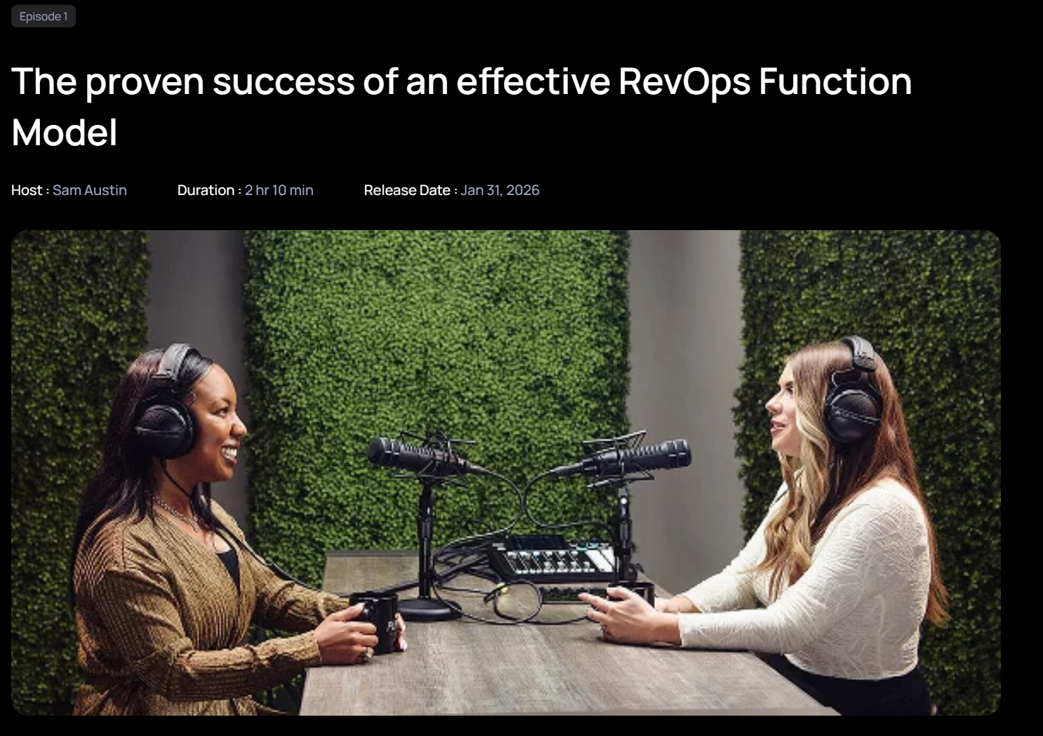
 Podcast inner-page banner with an eyebrow, title, host name, duration, and release date. Supports MP4 or YouTube video. 


Description Box

Rich-text content block for inner pages. Accepts any formatted copy.


Platforms
Podcast platform links (Spotify, Apple, etc.). Each item has a title, link URL, and platform icon image.
Guest Cards

 Podcast guest profile cards with an image, guest name, and designation. 

Podcast Cards
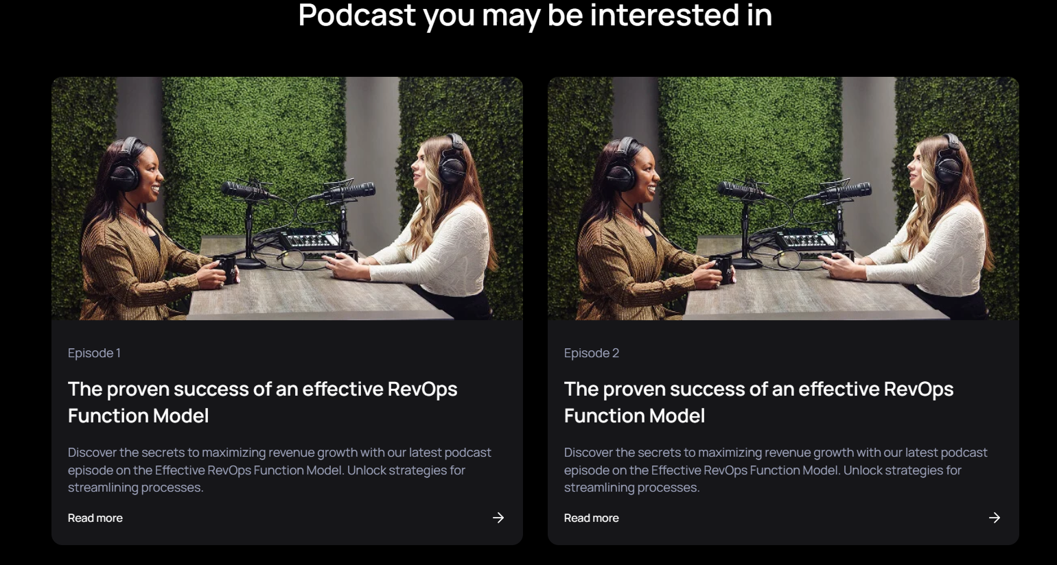
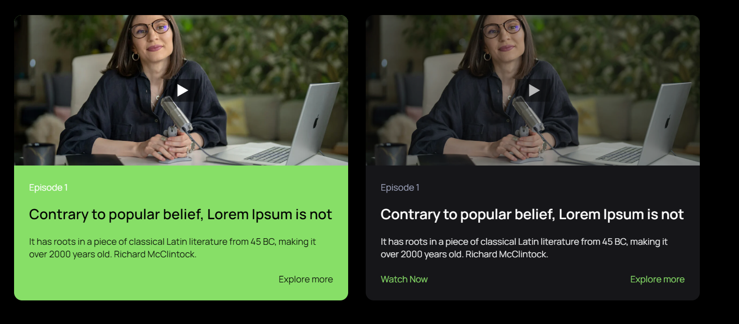
 Grid of podcast episode cards with a thumbnail, title, rich-text excerpt, and a listen link. 

Cta Section

 Full-width CTA banner with a two-part heading (plain + green highlighted text) and a single button. Edit both heading lines, the highlighted phrase, and the button label and link. 

Podcast Page

Modules

Banner With Background Image
 Hero banner with a title, subtitle, review image, and background images. Variant of the video banner without an embedded video. 


Platforms

Podcast platform links (Spotify, Apple, etc.). Each item has a title, link URL, and platform icon image. 


Podcast V2
 Full podcast listing with a category filter. Each episode has an icon, title, thumbnail, episode number, video or transcript file, and a link. 
Cta Section

 Full-width CTA banner with a two-part heading (plain + green highlighted text) and a single button. Edit both heading lines, the highlighted phrase, and the button label and link. 

RevOps Bulletin Inner Page

Modules

Banner With Content
Inner page hero with a title, subtitle, and background images. Includes job metadata fields (type, experience, employment type) for career pages.


Description Box
Rich-text content block for inner pages. Accepts any formatted copy.
  

Video content
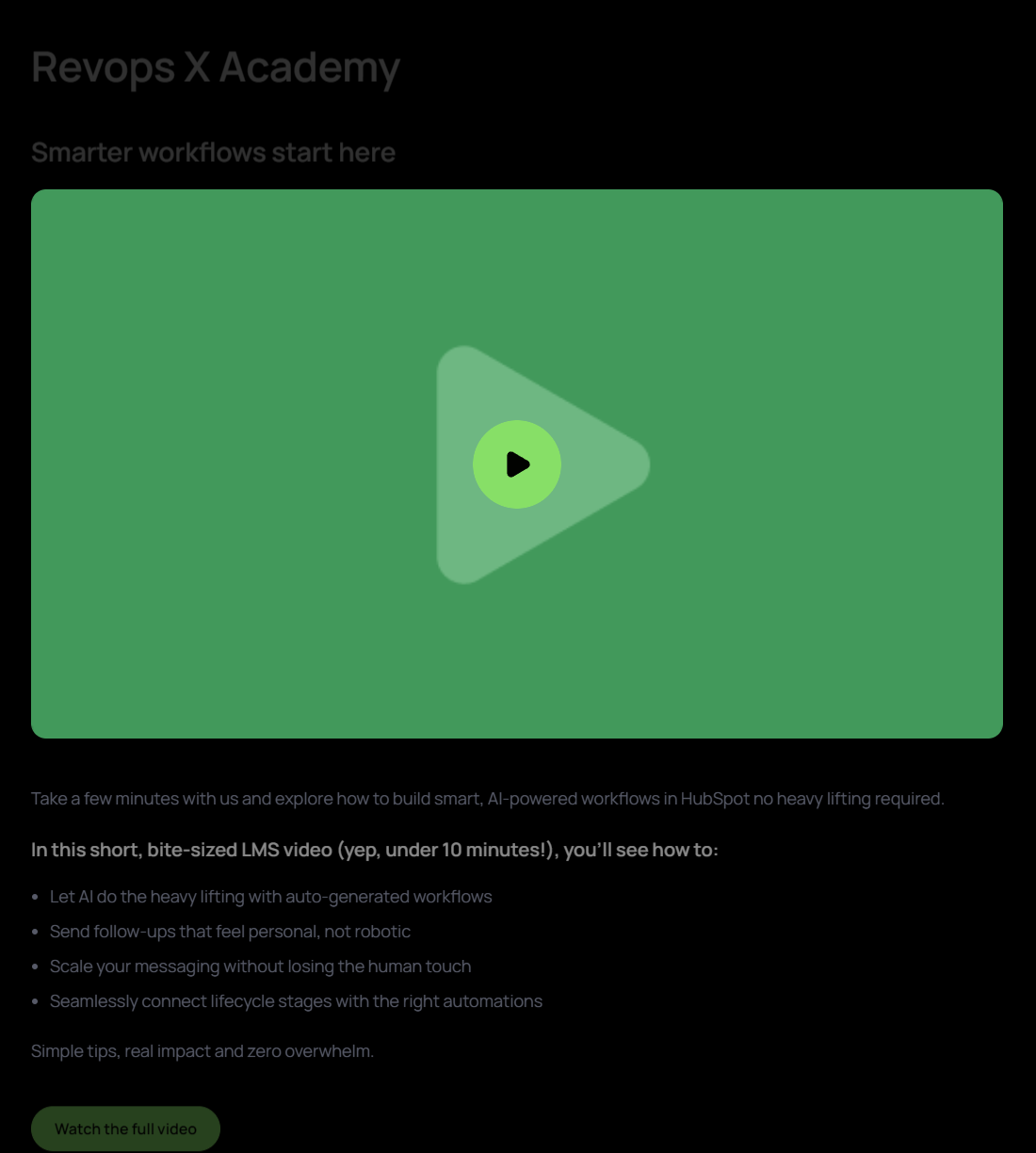
 Video block with a title, subtitle, MP4 or YouTube video, thumbnail, rich-text description, and a link. 
Four Column Resource Cards V2

 Resource card grid with a section title, subtitle, and description. Supports 2–4 columns; each card has an image, title, description, and link. 

Cta Section

 Full-width CTA banner with a two-part heading (plain + green highlighted text) and a single button. Edit both heading lines, the highlighted phrase, and the button label and link. 

RevOps Bulletin Page

Modules

Banner With Video
 Hero banner with a title, subtitle, background images, and an embedded video. Edit the review image, background, and left/right decorative images.  


Four Column Cards
  Four-column icon-and-title card grid for careers pages. Each card has an icon and title.  
  

Cards Grid
 Year-filterable card grid for RevOps Bulletin. Each card has a date, title, link text, and URL. 
Cta Section

 Full-width CTA banner with a two-part heading (plain + green highlighted text) and a single button. Edit both heading lines, the highlighted phrase, and the button label and link. 

Sales Ops

Modules

Services Banner Img Text
 Services page hero with a subtitle, title, description, and a main section image. 


Testimonial
Customer testimonial slider with company logo, quote text, author photo, name, and designation.

Card Stack Module
Stacked scroll animation section with background image, section title, subtitle, description, and card images.

Cards With Pointertext

Three-column feature cards section with a section title, subtitle, and description. Each card has an image, title, description, and link; supports left/right background images.

Two Column Resource Cards

Two-column resource card layout with section title, subtitle, description, background image, and per-card image, title, description.
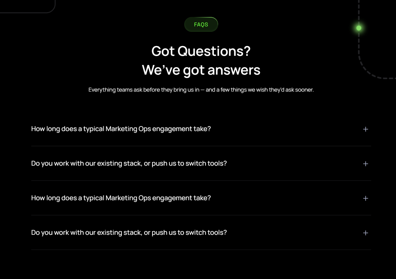
Four Column Resource Cards

Resource card grid with a section title, subtitle, and description. Supports 2–4 columns; each card has an image, title, description, and link.
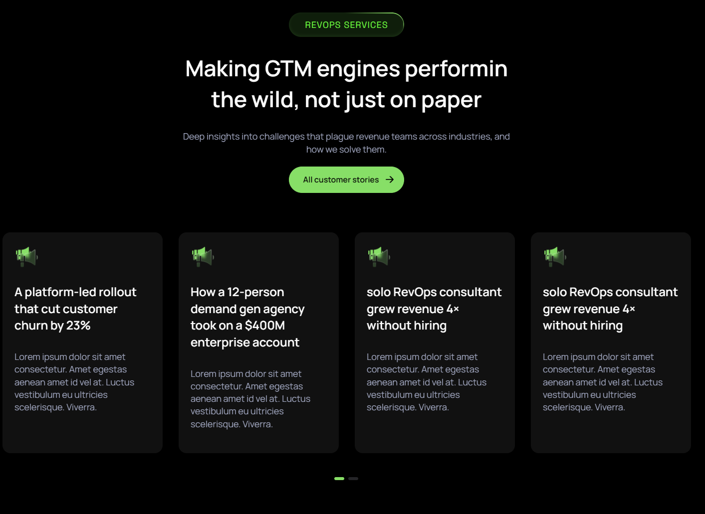
Faq

Accordion FAQ section with a title, description, and background images. Each item has a question and rich-text answer. 
 

Cta Section

 Full-width CTA banner with a two-part heading (plain + green highlighted text) and a single button. Edit both heading lines, the highlighted phrase, and the button label and link. 

Services Ops

Modules

Banner With Video
 Hero banner with a title, subtitle, background images, and an embedded video. Edit the review image, background, and left/right decorative images.  


Four Column Resource Cards

Resource card grid with a section title, subtitle, and description. Supports 2–4 columns; each card has an image, title, description, and link.
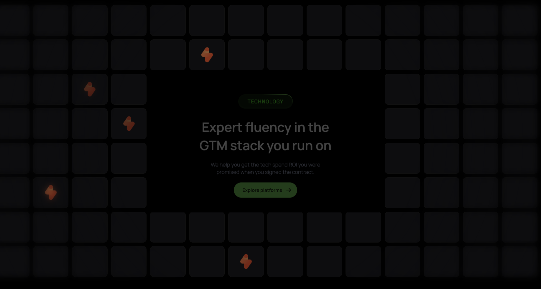
Grid Logos With Center Content
 Logo grid with a centred title, subtitle, and description. Position each logo by column and row number. 
Testimonial

Customer testimonial slider with company logo, quote text, author photo, name, and designation.
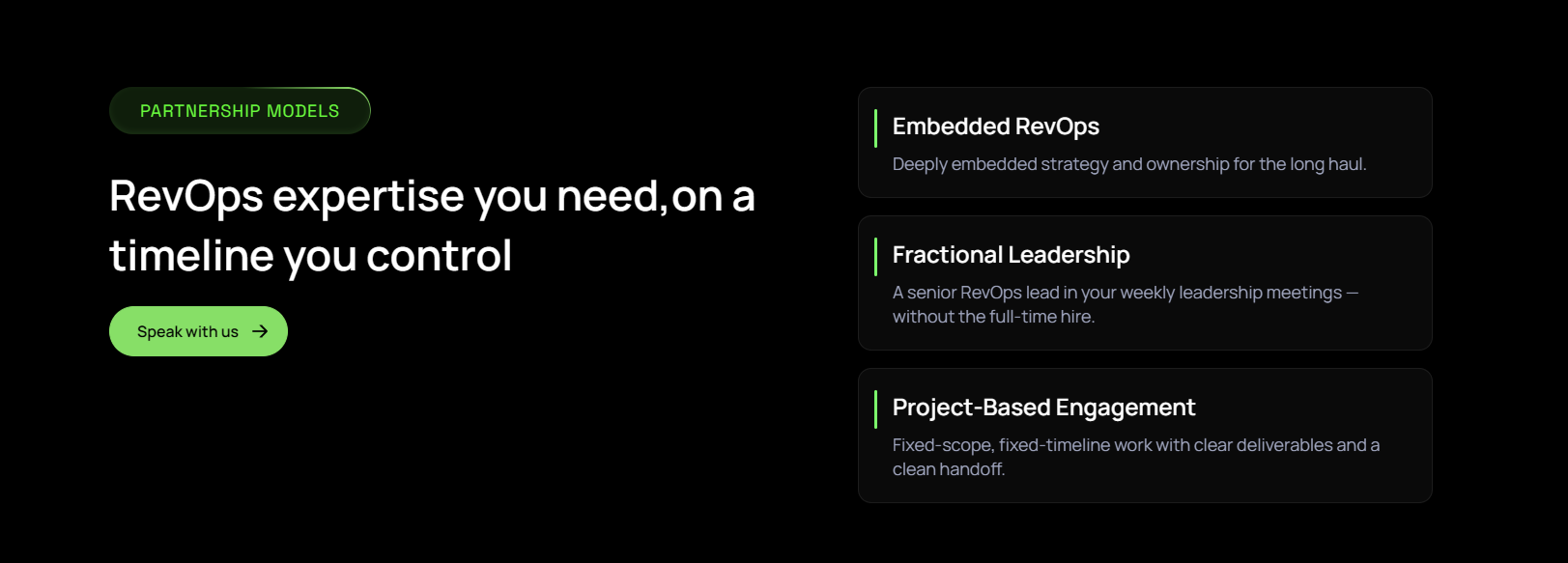
Vertical Cards
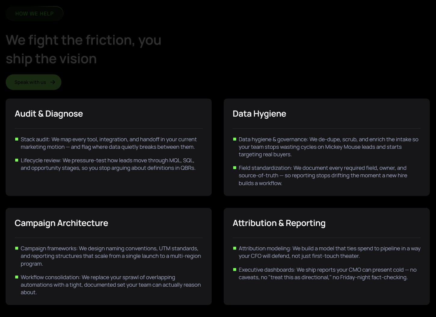
 Vertical stacked service cards with a subtitle, section title, and description. Each card has a title and description. 

Two Column Resource Cards
Two-column resource layout with a section title, subtitle, description, and CTA link. Each card has an image, title, and description.
Faq

Accordion FAQ section with a title, description, and background images. Each item has a question and rich-text answer. 
 

Cta Section

 Full-width CTA banner with a two-part heading (plain + green highlighted text) and a single button. Edit both heading lines, the highlighted phrase, and the button label and link.